LetsGrow
About LetsGrow
LetsGrow is a non-profit organization (still in its conceptual phase) that aims to help improve financial literacy, especially among low income and recently immigrated families. The banking system is highly complex and seems scary to a lot of people, so LetsGrow wants to try and dispel some of that mystery through instructional material and free consultations.
To try and make the group as approachable as possible, I really focussed on avoiding any of the monolithic elements that banks often associate with. This included acronym names like RBC, HSBC, TD, CIBC, etc.; as well as overly-serious visual design. We wanted instead to seem playful, friendly, and down-to-earth. With this in mind, a nature theme stuck out very early on, and was the inspiration for the rest of the design process.
Naming
In keeping with the nature theme, we wanted a name that didn’t directly mention money or finance, and instead evoked growth and collaboration. Over several iterations, we eventually settled on the name LetsGrow, a name that is simple to remember and checks all of our boxes.
Logo and Color
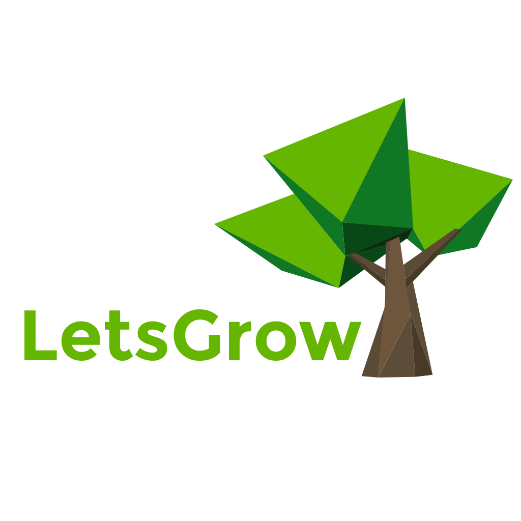
For the logo, the simplest expression of the growth and nature motif that we wanted to portray was that of the tree. I was inspired by the clean, fun look of polygon graphic style and had been wanting to challenge myself by making something of that sort, so I attempted several iterations of a polygon tree before arriving at the finalized design. The form itself is obviously recognizable as a tree, but is playful in its execution. For coloring, I stuck with bright apple greens and coffee browns in various tones to emulate shadow, and I think the result is quite effective. The font is Montserrat Bold.


