Jay
Background
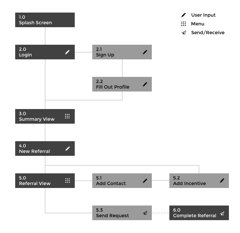
This project was developed in conjunction with Mark3 Research as the final year/capstone project for myself and my 4 teammates. Jay is a cross-platform application, developed for iOS and Android using the Ionic+Angular+Cordova development system. Part of my responsibility was for the user experience of the application, in addition to the branding.
The Problem
Jay is designed to be a referrals application that people can use to direct their friends to the small businesses that they use and be paid for it in return. The issue is that doing this is already simple; all a person has to do is make a few calls/texts/whatever and it’s done. We needed to provide a richer experience, capitalizing on making the hard parts (like payment, reviews, and keeping track of everything) super easy; but for it all to work, we needed to make sure that the quick and easy stuff (like signing up, sending a request, and responding to one) stayed just that: quick and easy. This is key to the success of the platform. If the app is clunky, then the user won’t bother with the app. It’s that simple.
The Design
Framework
Our team needed to hit the ground running with this project, so to get the ball rolling quickly, we based our design language on Material Design. Material is robust and well known to users, which is important to make the app feel as familiar as possible. Settling on a dark theme, we decided on a rich, bold color palette that focused on the Amber color used in the branding.

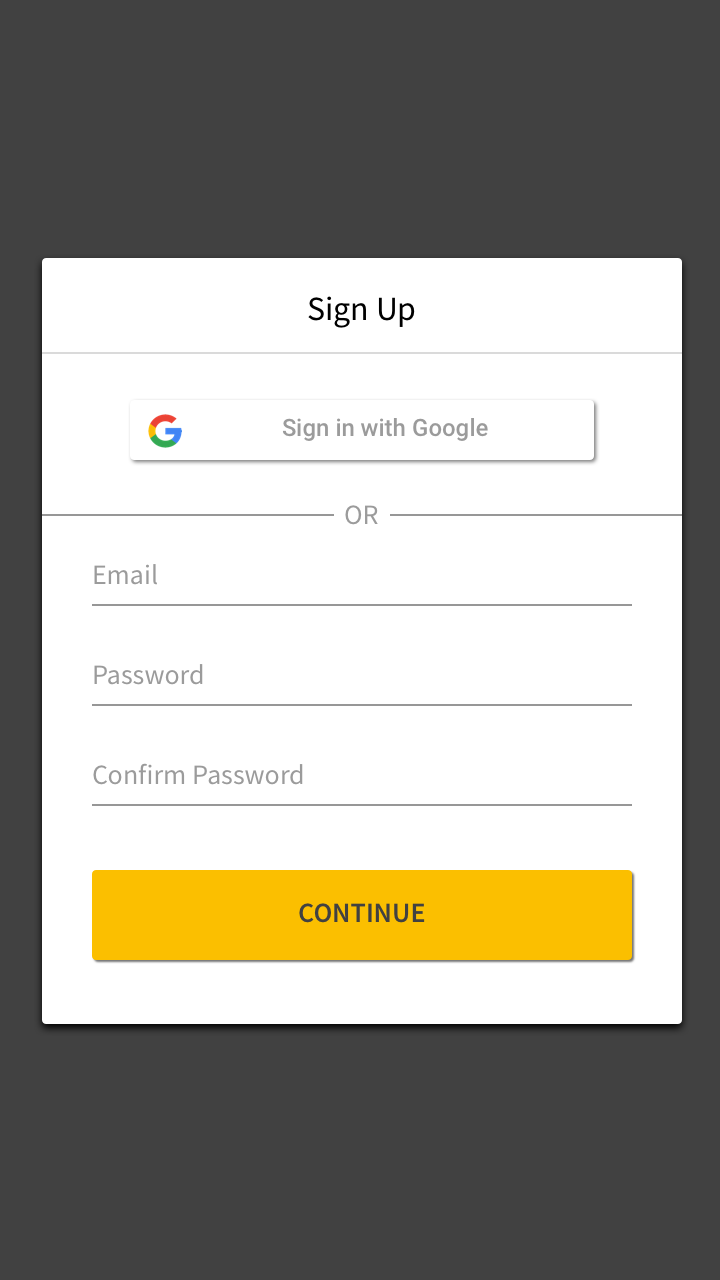
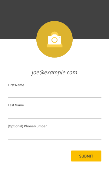
Getting Started Must Be Easy
Signing up for the platform needed to be simple, so all the user needs to start using Jay is their name and email, plus a phone number and a photo if they want. We figured this could be even faster (yes, faster than that!), so we integrated with Google sign on to give users a one click solution. And just like that, you’re ready to go!
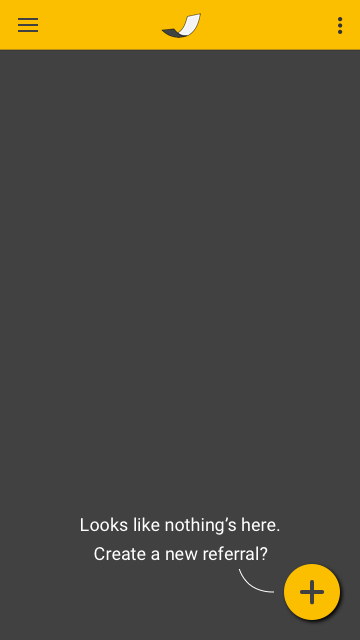
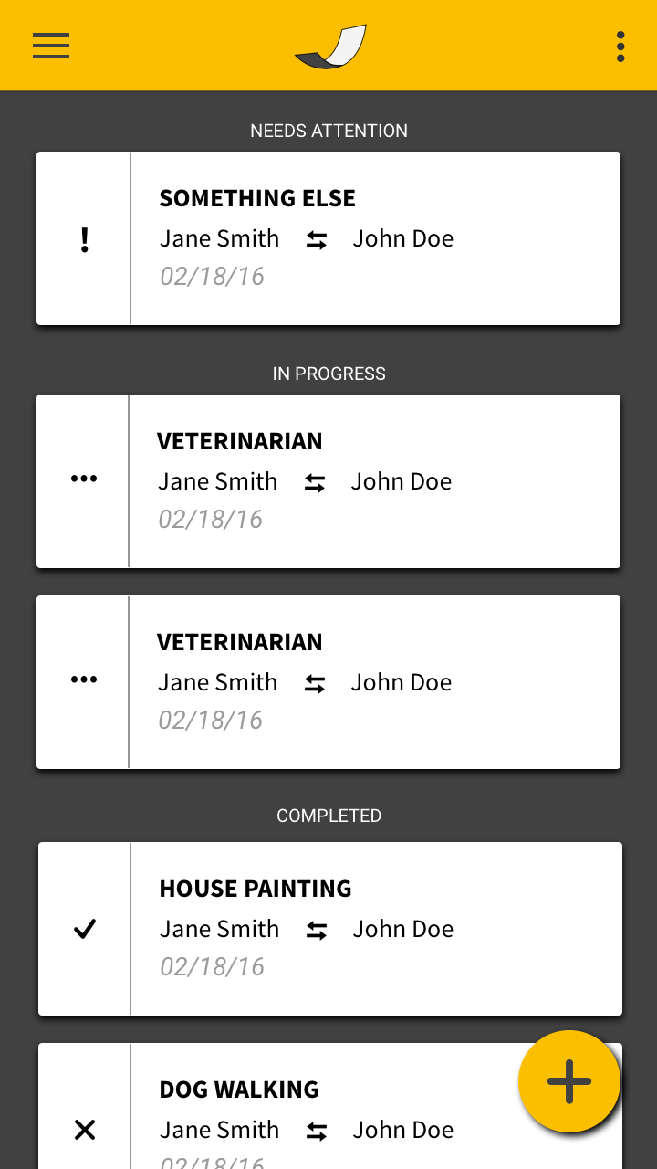
Everything In One Place
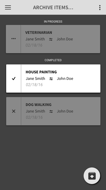
The organized summary view should put emphasis first and foremost on what needs the most attention. With this in mind, Jay puts the referrals that need the user’s action first, followed by the referrals that are in progress, followed by the referrals that have been completed. If things get cluttered, the user can sweep them away with archive.
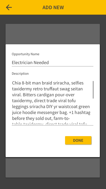
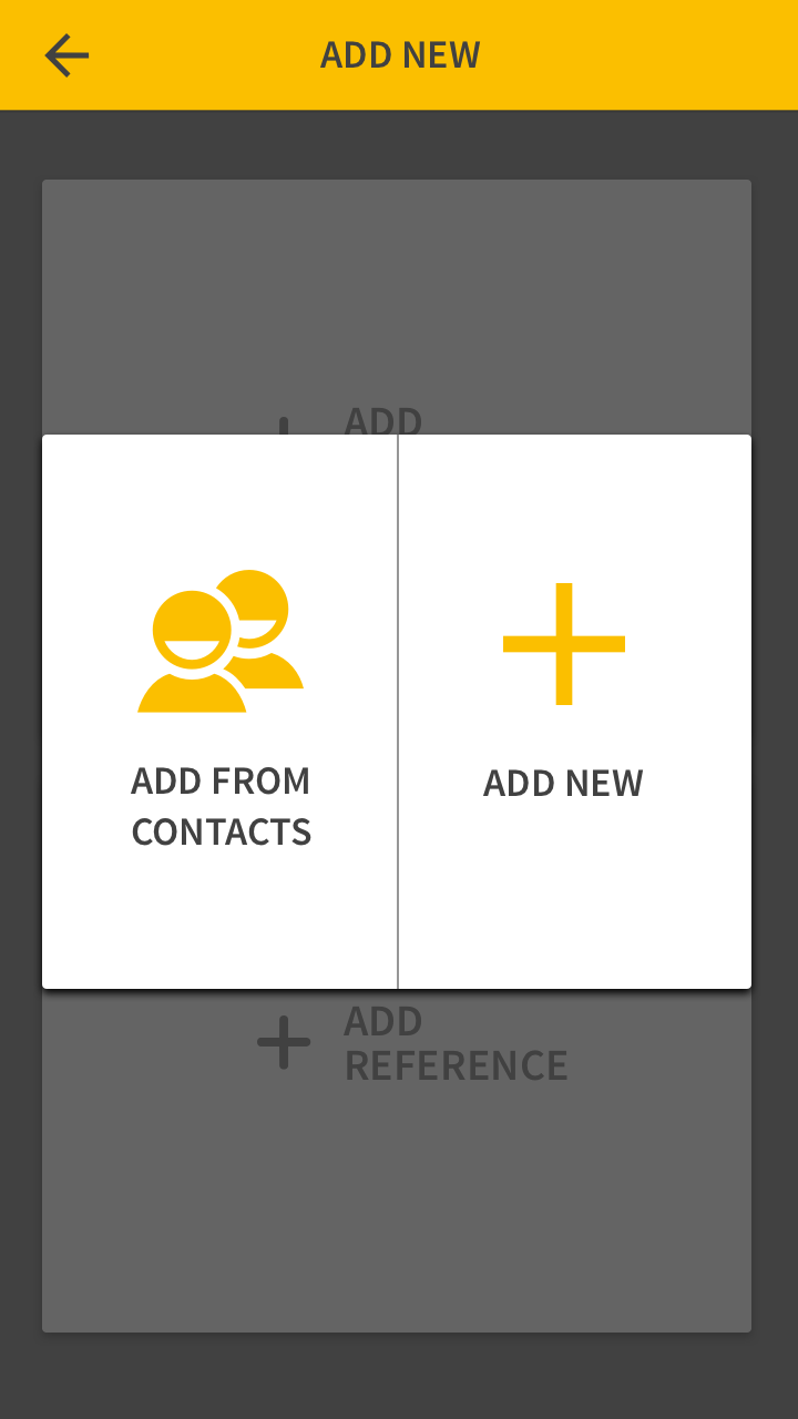
Get Up And Running FAST
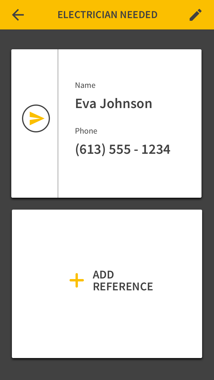
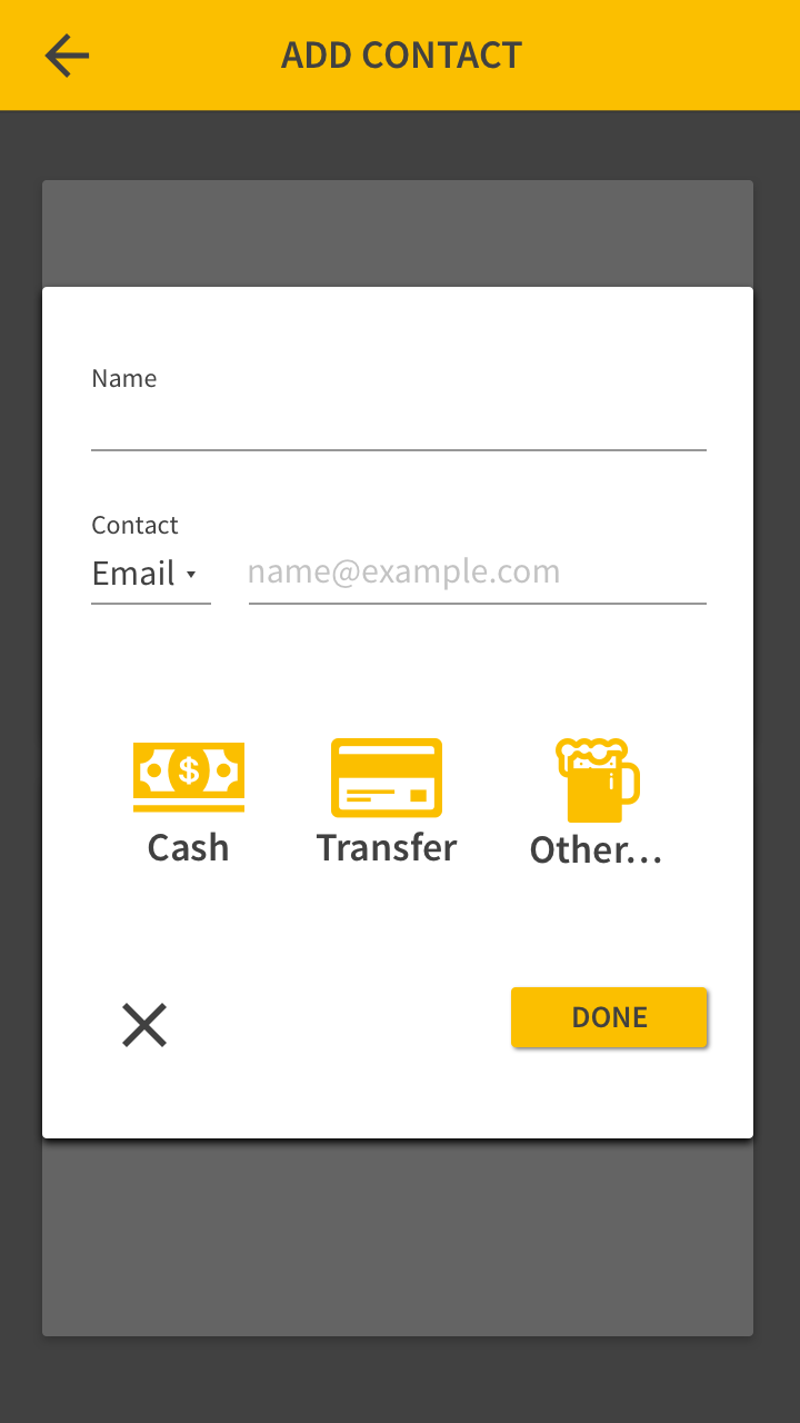
Creating a new referral gives the user a space to describe as much or as little as they like, and then add the contacts manually or straight from the native contact list. The layout is simple: Business on top, and Contact on the bottom.
Replies Must Be Effortless
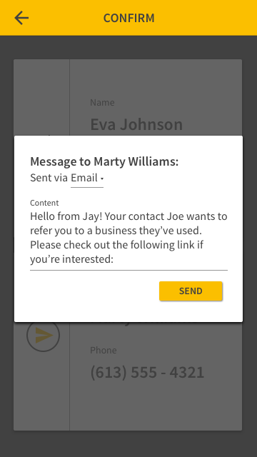
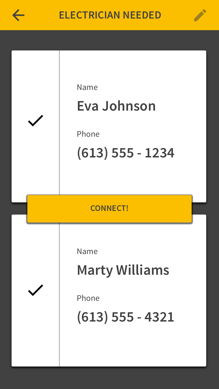
Once both sides have been contacted and accepted, the user simply has to hit Connect, and the match is made!