bdnk.me
Purpose
The main goal of this project was to create a showcase for my past work. Until now, most of my visual work had been hosted on Behance (link), but I wanted a platform that I had developed myself, to be able to showcase more of my non-visual work while demonstrating actual implementation first-hand.
Concept
The initial design concept focuses on a burst of bright color and bold text to engage the reader, which transitions into a clean, simple summary of the site’s content. I’m a big proponent of Material Design concepts, so I used that as the basis for the rest of the site’s language, specifically its use of cards, and the responsive grid. Using Sketch to prototype what I wanted to accomplish, I developed the following vector graphics.
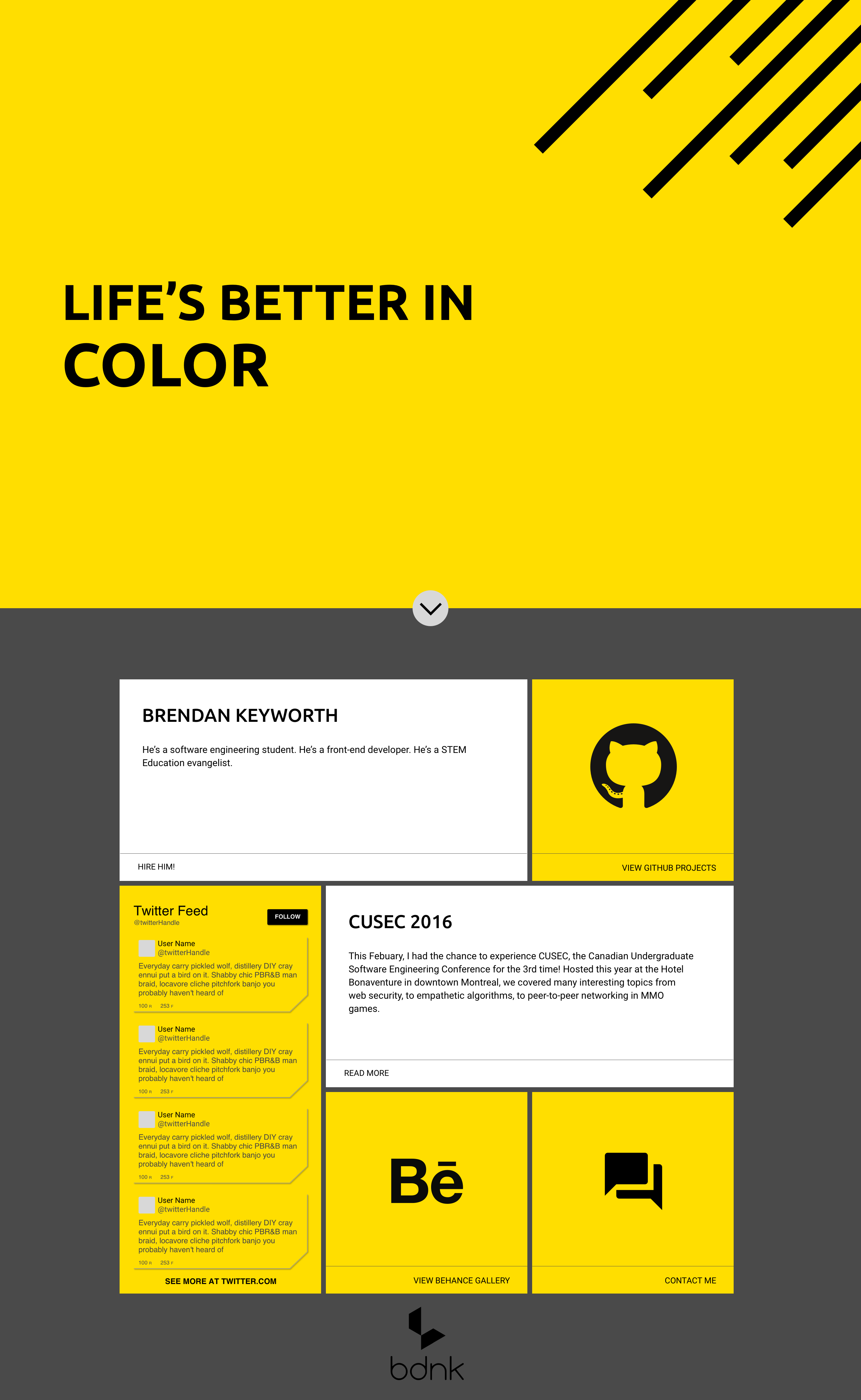
Material Design Lite
To get the site up and running quickly, I wanted to use a CSS framework that would take out some of the gruntwork. With Material Design in mind, I decided to make use of a framework that focuses on Material. I’ve looked into Polymer in the past, but decided to go for a simpler implementation, so I chose MDL, aka Material Design Lite.
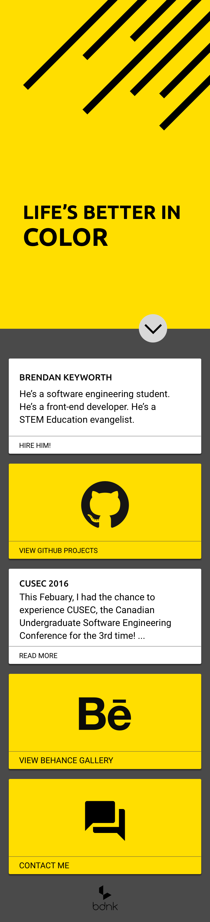
MDL provides a library of CSS components that cover the bulk of the standard Material elements, from the grid, to cards, to layouts, etc. These components organized using BEM, which stands for Block-Element-Modifier, a naming scheme for CSS classes that helps to keep style files from turning into a jumble of unintelligible names and keeps things DRY. MDL is a fully responsive framework, which was important as I wanted the page to be easily viewable from mobile devices in addition to the desktop.
Implementation
The actual structure of the site is quite simple, with a single landing page, branching into the various pages that make up the site, as well as various links to my content on other sites. I wanted to limit the clutter of the page, keeping things as clean and simple as possible, which meant avoiding things like menus, pagination, and complex javascript pieces like carousels or twitter feeds.
Midway through developing this page, I read an interesting Medium article on CSS organization by Mina Markham about the making of Pantsuit, the UI pattern library used by the Clinton 2016 campaign. Part of the article covered the modular architecture in Pantsuit, which is based on the ITCSS and namespacing scheme’s laid out by Harry Roberts. Essentially, Pantsuit breaks its CSS classes into ‘types’, which makes it easier for a developer to see the scope and function of a class, at a glance, by ‘namespacing’ it with a prefix. For my purposes, I adapted the Pantsuit namespace model into the following system:
- .a- //Alterations, specific and highly-reusable styling overrides (e.g. vertical center)
- .c- //Components, the building blocks of the site
- .l- //Layouts, purely visual stylings
- .t- //Themes, context specific stylings (e.g. for an article, containing specific markdown)
Future Work
There still is a lot of work to do on this site, and I will be constantly upgrading and improving it as I continue to learn new techniques and work on new projects. I plan to rework the site using Sass preprocessing, and hopefully move away from MDL to develop my own component library from scratch. Stay tuned!